
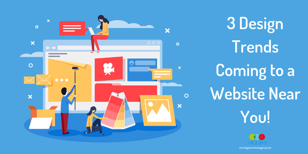
3 Design Trends Coming to a Website Near You!
In our opinion, one of the best things about web design is that it’s always changing. Sure, that introduces some challenges, but it also keeps things fresh and interesting.
It seems there are always new layouts, color schemes, widgets and typography combos to experiment with. And, or course, there are larger shakeups introduced by Google and others that demand you stay on your game.
As interesting as all this might be to us, to the typical business owner it means a lot of work trying to stay current and outpace their competition.
So what are you supposed to do?
Not all the latest web design trends are going to be worth your time. You don’t need all the bells and whistles to have a good website. But change can be good, refreshing even, when done for the right reasons. In our minds, there are two important RIGHT reasons:
- to create an exceptional experience for your prospects
- to convert a higher percentage of those prospects into leads or sales.
Here are three notable web design trends we’re seeing that you may want to consider implementing for your company’s website.
Minimalist Vibe
This one is really a continuation of an existing trend. Sometimes less really is more, and that’s certainly true when it comes to the modern website. Right now we’re seeing a big push for even MORE simple, MORE clean designs. Not only does a minimalist site lend an air of sophistication to your business, but it’s much easier for users to navigate and consume. A minimalist approach to web design puts your message front and center, and isn’t that the whole point of your website?
In case, you need a visual to solidify this concept, there’s no better example than the Kings of Minimalism… Apple

But there is a risk here. Don’t let form take your eyes off function. Content is still important, especially if you want any chance of being found in the search engines. We often advise our clients to present their content in “layers,” allowing their prospect to consume the information at the layer that make most sense for them:
Layer 1: Headlines and concise benefit-focused descriptions
Layer 2: Expandable or link-accessed supporting information (the cliff notes)
Layer 3: Downloadable or reference page resources (the more detailed stuff)
Bold Color Use
With flat, minimalist designs ruling the day, business owners have opted for bright pops of color to create visual interest on their sites. The use of bold colors can really shape the look & feel for your brand, setting the tone for what customers should expect. Plus, they’re great at drawing customers in. Calls to action, important messaging, you name it –– it’s more impactful and more memorable when it’s said in color.
Pro Tip: The power of color often lies in its “contrast effect” – its ability to draw attention from one area on the page to another. As such, it’s important you don’t inadvertently create competition for that attention by overusing bold colors – here are a couple examples, we’ll let you decide which website best leverages the contrast effect, and which doesn’t…
Micro-Interactions
Here’s a design element that’s certainly on the rise. Chances are you’ve had a micro-interaction while using an app or while navigating a favorite website and you didn’t even realize it. A micro-interaction is just a fancy name for an interactive single-task event. Their purpose? To entertain and delight the user.
You can find some good examples of micro-interactions here. These may seem like a small element in the overall design (they are “micro” interactions after all), but more and more, they are playing a growing role in giving customers instant feedback, making their experience more engaging and interactive. Here’s a quick example:
Like anything, micro-interactions can be overdone. So be careful to use them only when they truly add value to your website visitor.
These are just a few things to keep your eye on as your consider your next website redesign. It’s truly becoming a mobile-centric world and the latest design trends certainly reflect this. As always, if you need assistance with website design, SEO, PPC or other areas of your marketing strategy, feel free to contact us for a free consultation!